As a veteran office worker, if you do not know how to use Pivot Table when encountering huge and complex statements in sheets, I believe the day will be the worst day in the week. This article shows on how to use Google Sheets, which is a more intuitive interface than Excel to design spreadsheets and easy to get started with Pivot Table analysis. Let’s get started with just 6 steps to master Pivot Table.
What is Google Sheets Pivot Table?
“Pivot table”, which sounded like a high-end application, is actually a fast classification tool used by Excel to summarize reports. When I first join the company, I was curious on how my seniors could easily analyze the trend of data. Hence, to not letting you guys to be like me when I first started to work, I am going to share this secret technique with you to help in your work.
Google Sheets Pivot Table
There are many reasons you will need to use Pivot Table. The following scenarios are good examples when you would need to use it.
Scenario 1: The order data sheet that accumulates whole month, including price and goods. The information is clear when it doesn’t have a complex data, however, it is a very tiring job if it has a lot of data in spreadsheets.
Scenario 2: There are many branches across regions and country, and different employee ID for each employee. In order to make the quarterly report table will consume a lot of your time.
Scenario 3: You are able to use the Pivot table to create a cash flow statement. No matter you are running a business or you do it for personal use, it is hard to check all the records one by one, and to come to a good solution for your financial problem.
Hence, you would need Pivot Table to analyze and understand the real meaning of your numbers!
6 steps to master Google Sheets Pivot Table
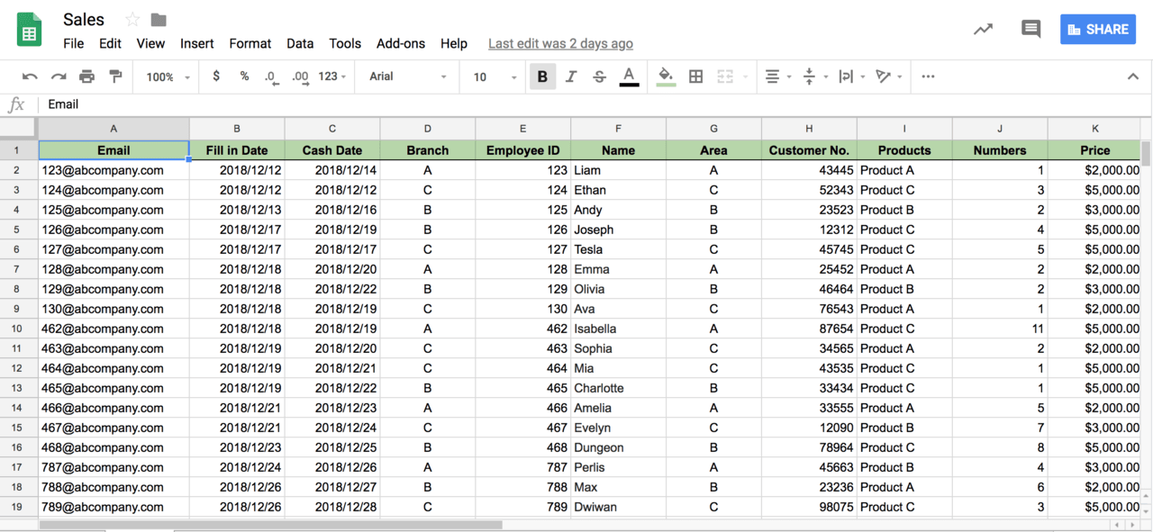
First, you would need to have a”complex data”spreadsheet to do Pivot Table. Here is the example of sales report from multiple branches.
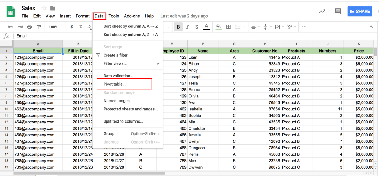
Step 1: Open the Pivot Table
Select the range of data you would like to analyze, and then open the”pivot table”. You can open the”Pivot Table”by clicking the”Data”on the top. Every time when you click on Pivot table, it will add a new spreadsheet for the pivot table. This is to avoid many reports to be appeared disorderly, and allows you to trace back your previous data.
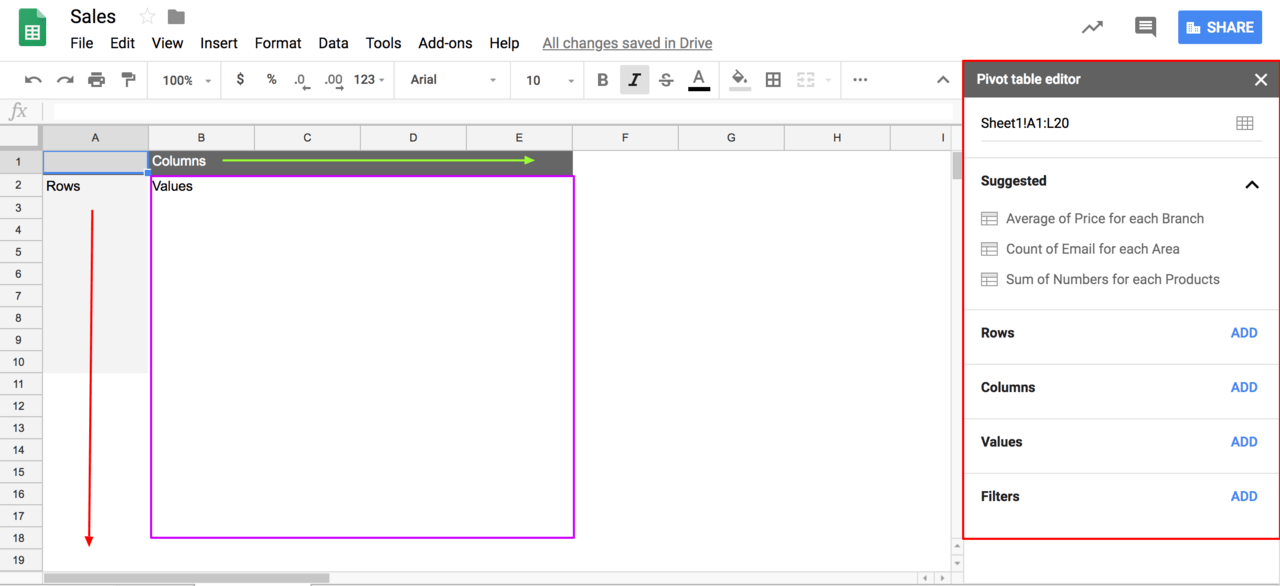
At the left is column (Green arrow), rows (Orange arrow) and Value (Purple box)
On the right, from top to bottom:
Selected Range→Suggested →Rows→Columns→Values→Filters
Step 2. Choose Pivot Table data
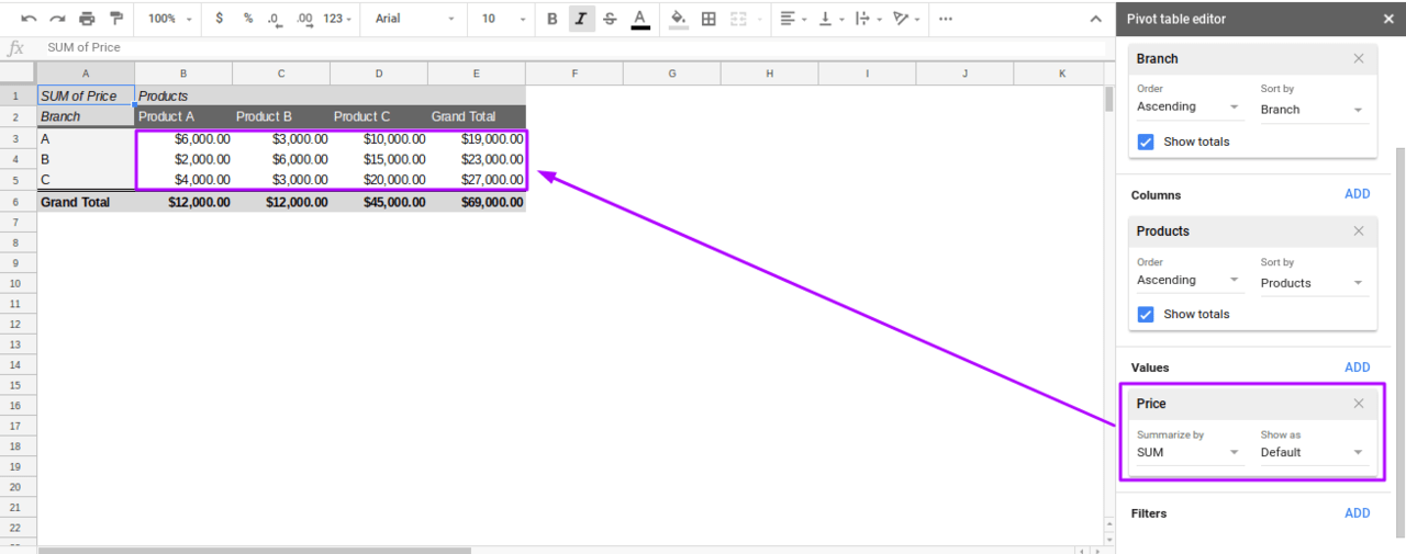
In order to determine which product is the best seller in my company, I need to know what is the sales volume of the products sold by each branch. So that, I can analyze the pros’ of the product and purchase more to sell to numbers of customers in the future.
Pivot Table data:Which Branch, Which Product, How many sales?
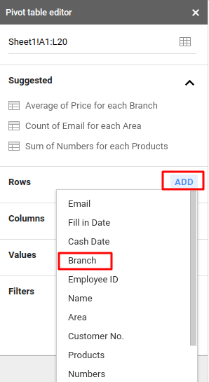
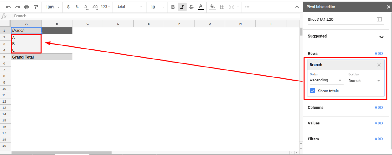
Step 3. Choose “Rows”, to choose main data
Choose your data on right, then it will appear on the report on the left. Google Sheets allow you to move all your data flexibly.
In this example, I am going to show”branch”as the main data. So, let’s add”Branch”in”Rows” as picture shown below.
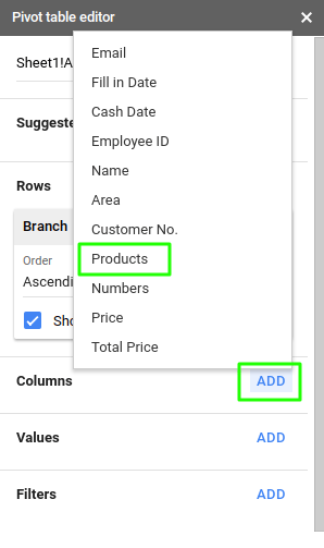
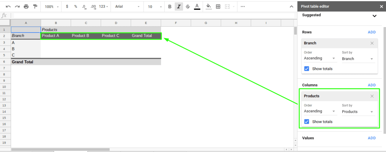
Step 4. Choose “Column”, pick data that wanted to be discussed
When the main data is selected, the choice of another type of data determines what information you wanted to discuss. In this example, I would like to discuss about products. So, I add “Product” at “Column”.
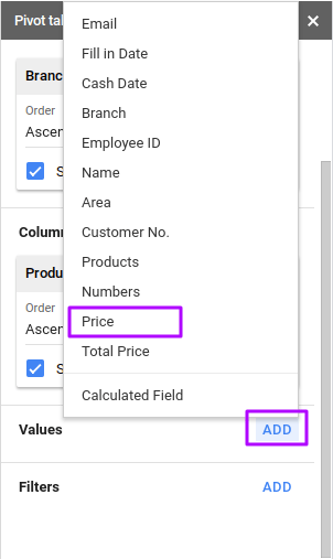
Step 5. Choose “Value”. Pick the quantitative value!
After we got column and rows, we add the quantitative value. In this example, we use total price as our value.
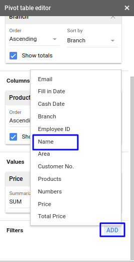
Step 6. Filter the data
When you want to focus on analyzing a particular information, you can use”filters”to filter and analyze your data.
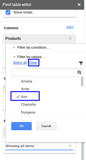
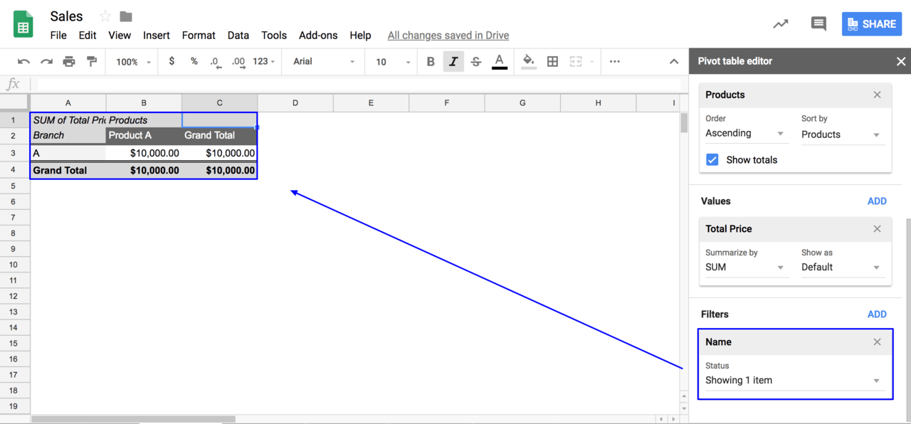
For an instance, I want to focus on the performance of a particular salesperson. As picture shown below, I want to know Ava’s sales performance. Hence, I will go to”filter”and click”add”to add”Name”. Then, clear all values and choose Ava. Now, I am able to check how many sales she made at the branch which she is working.
Do you feel that Google Sheets Pivot Table is very simple and easy to use? Yes, it is! So next time if you have to do a large and complex data report, you can utilize the tools of Google Sheets Pivot Table to do it!