I believe many people is using Google Sheets to make charts? In fact, you don’t need to spend a lot of effort. Just fill in the needed data and you can make a professional chart with just one click! Follow the steps below to produce a variety of charts without excel!
Step 1. Create a data field on Google Sheets.
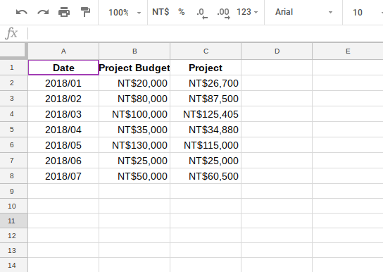
Once you open a Google Sheets, you only need to fill in the corresponding data in the space.
Step 2. Insert a chart into the Google Sheets and open the Chart Editor.
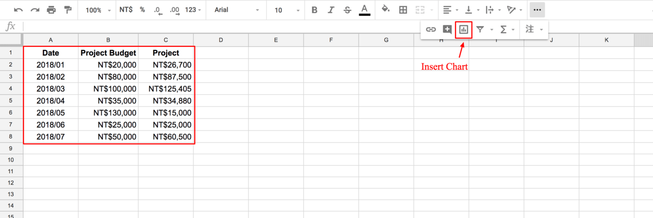
Once the data is completed, click on the “Insert Chart” button at the top right to open the chart editor.
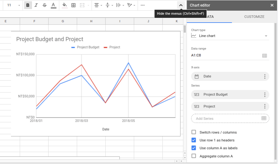
Then you will the related chart will be shown up in your Google Sheets. This feature does not only show the related chart with your data, however, it also gives you the needs to customizing the charts based on your preference.
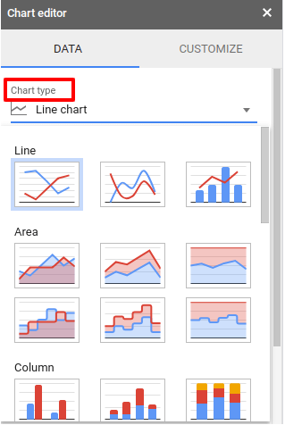
In the”Data”section above, you can see there are various types of charts. It includes area chart, graph chart, histogram, pie chart and others. This allows the users to pick either one of the chart that is suitable for their data.
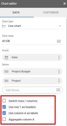
The options highlighted in red above shows that you can check the boxes according to your needs. For an example, in the chart editor shown above, check the corresponding column item with the first column as the title, so that you don’t have to check the number one by one.
Step 3. Customize your chart to let it look amazing!
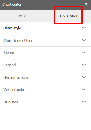
In”Customize”, you will find chart interface settings such as”Chart Style”,”Series”,”Legend”and”Horizontal Axis”. You can customize according to your preferences and make the best Google Sheets.
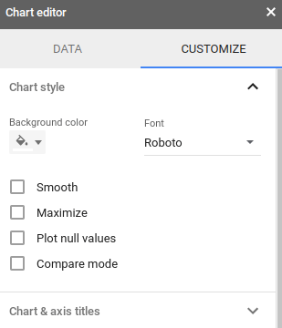
Moreover, you can modify the background color of the chart. You can set the chart for different background color in a presentation or other platform.
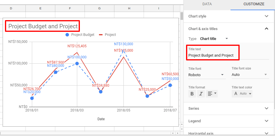
You can change the title in”Title Text”. For routine report, which is only the date or other minor changes, you can adjust the chart information directly without having to create a new chart!
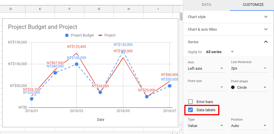
In the”Series”, the”Data Label”will show value and be displayed in each interval data. It is convenient to use and you don’t need to move your mouse around to see the value.
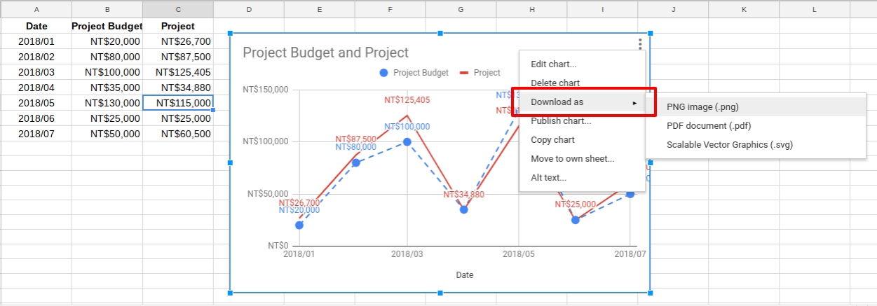
In addition, if you want to save the chart and use it for other purposes, you can also click the”⁝” button at the top right and click”Download as”to download the chart file.
One click to update! Let the chart link to the latest data from Google Sheets.
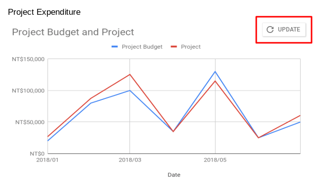
Charts are often have to be reported in response to the needs of the report, so if the original document has been modified, shall we update the data by ourselves?
Of course not. Even if the chart is used in other Google Slides, when the original file is changed, the “Update” button will appear on the chart. With a single click, you can synchronize the corrected and updated the content in the Google Sheets!
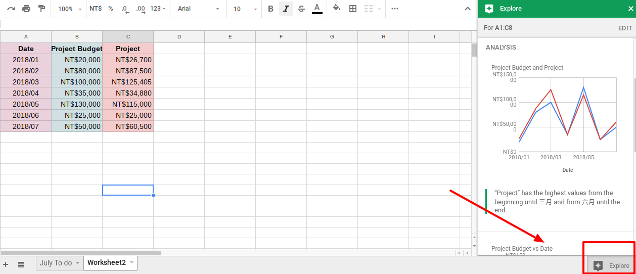
There is also an”Explore” features in Google Sheets. You can make the suggested chart with just a click. Check it out!
Google Sheets is a very convenient tool for the graph and chart functions. You are able to create quite high quality and beautiful charts with little effort. If you are an office worker who often works with graphs and charts, exploring this feature isn’t a waste for you!